{{post.content}}

- Reed Piernock, they/them
- Senior Web Front-end Developer
- Georgetown University, Washington DC
KSS on My List
building a living style guide & pattern library with KSS-Node
./package.json
{
  "name": "sample-kss",
  "version": "1.0.0",
  "description": "Sample KSS",
  "devDependencies": {
    "sass": "1.35.*",
    "kss": "3.0.*"
  }
}
./package.json
{
  "name": "sample-kss",
  "version": "1.0.0",
  "description": "Sample KSS",
  "devDependencies": {
    "sass": "1.35.*",
    "kss": "3.0.*"
  },
  "scripts": {
    "build:kss": "kss --config kss-config.json",
    "build:css": "sass --no-source-map src:dist/css"
  }
}
./kss-config.json
{
  "title": "Sample KSS",
  "source": "src/",
  "destination": "styleguide/",
  "builder": "builder/twig/",
  "css": "../dist/css/styles.css"
}
./kss-config.json
{
  "title": "Sample KSS",
  "source": "src/",
  "destination": "styleguide/",
  "builder": "builder/twig/",
  "css": "../dist/css/styles.css",
  "namespace": [
    "color:src/color",
    "text:src/text",
    "link:src/link",
    "card:src/card",
    "layout:src/layout"
  ]
}
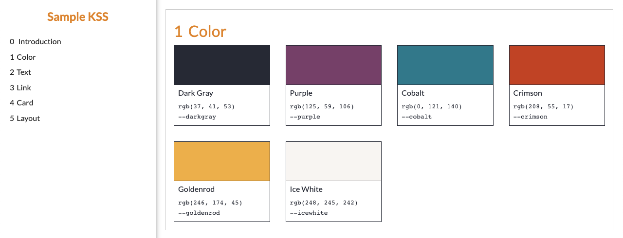
./src/color/_index.scss
// Brand Colors
//
// Colors:
// --darkgray: rgb(37, 41, 53) - Dark Gray
// --purple: rgb(125, 59, 106) - Purple
// --cobalt: rgb(0, 121, 140) - Cobalt
// --crimson: rgb(208, 55, 17) - Crimson
// --goldenrod: rgb(246, 174, 45) - Goldenrod
// --icewhite: rgb(248, 245, 242) - Ice White
//
// Weight: 1
//
// Styleguide: Color
:root {
  --darkgray: rgb(37, 41, 53);
  --purple: rgb(125, 59, 106);
  --cobalt: rgb(0, 121, 140);
  --crimson: rgb(208, 55, 17);
  --goldenrod: rgb(246, 174, 45);
  --icewhite: rgb(248, 245, 242);
}
./src/text/_index.scss
// Text
//
// Weight: 2
//
// Styleguide: Text
// Heading
//
// Heading content defines the header of a section.
//
// Markup: eg-heading.twig
//
// Weight: 1
//
// Styleguide: Text.Heading

// Paragraph
//
// A paragraph is phrasing content one or more sentences.
//
// Markup: eg-paragraph.twig
//
// Weight: 2
//
// Styleguide: Text.Paragraph
./src/text/heading.twig
{%- set heading_level = heading_level | default(2) -%}

{{heading_text}}
./src/text/heading.twig
{%- set heading_level = heading_level | default(2) -%}

{{heading_text}}
./src/text/eg-heading.twig
{% include "@text/heading.twig" with { heading_text: "Taciti feugiat a sapien parturient" } %}

{% include "@text/heading.twig" with {
  heading_level: 3,
  heading_text: "Mi venenatis mus elementum"
} %}

{% include "@text/heading.twig" with {
  heading_level: 4,
  heading_text: "Posuere non sit pharetra"
} %}

./src/text/paragraph.twig
{{paragraph_text}}
./src/text/paragraph.twig
{{paragraph_text}}
./src/text/eg-paragraph.twig
{% include "@text/paragraph.twig" with {
  paragraph_text: "Curabitur vestibulum enim rutrum nostra dui eros sed sed vestibulum ..."
} %}

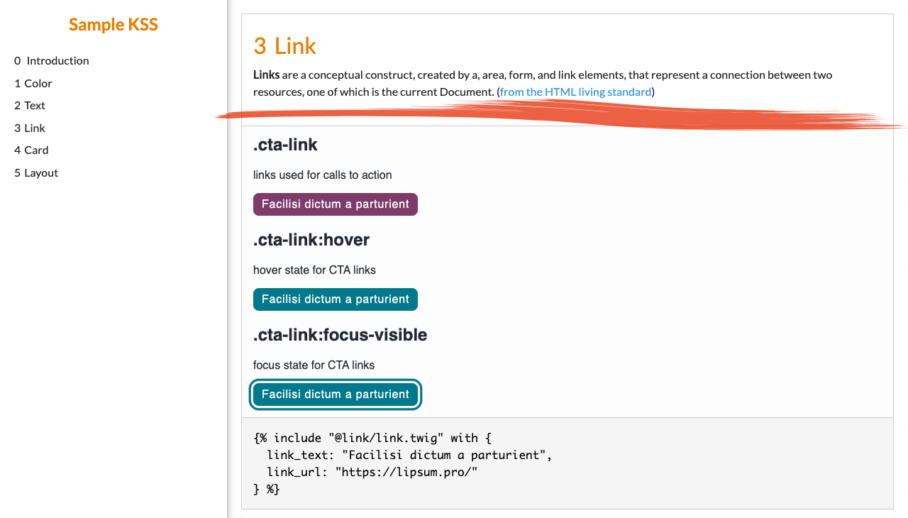
./src/link/_index.scss
// Link
//
// **Links** are connections between two resources...
//
// :hover - the mouse hover state
// :focus-visible - the keyboard focus state
//
// Markup: eg-link.twig
//
// Weight: 3
//
// Styleguide: Link
a {
  --color-link: var(--cobalt);
  --color-link-on: var(--purple);
  --outline-link-size: max( 2px, 0.08em );

  color: var(--color-link);

  &:hover,
  &:focus,
  &:focus-visible {
    color: var(--color-link-on);
  }

  &:focus,
  &:focus-visible {
    outline-size: var(--outline-link-size);
    outline-style: solid;
    outline-color: currentColor;
    outline-offset: var(--outline-link-size);
  }

  :focus:not(:focus-visible) { outline: none; }
}
./src/link/link.twig
{{link_text}}
./src/link/link.twig
{{link_text}}
./src/link/eg-link.twig
{% include "@link/link.twig" with {
  link_text: "Facilisi dictum a parturient",
  link_url: "#"
} %}

./src/card/_index.scss
// Card
//
// A card includes content and a call to action.
//
// Markup: card.twig
//
// Weight: 4
//
// Styleguide: Card
.card {
  --card-width: max(25ch, 50%);
  --card-padding: 1em;
  --card-border-color: var(--purple);

  width: var(--card-width);
  padding: var(--card-padding);
  border: 1px solid var(--card-border-color);
  border-radius: var(--card-padding);

  :is( h2, h3, h4 ):first-child {
    margin-top: 0;
  }
}
./src/card/card.twig
  {% if card_heading %}
    {% include "@text/heading.twig" with {
      heading_level: 3,
      heading_text: card_heading
    } %}
  {% endif %}

  {% include "@text/paragraph.twig" with { paragraph_text: card_description } %}

  {% include "@link/link.twig" with {
    modifier_class: "cta-link",
    link_text: card_link_text,
    link_url: card_link_url
  } %}
./src/card/card.json
{
  "card_heading": "Scelerisque nam eros parturient",
  "card_description": "Bibendum parturient laoreet a a purus augue hac vestibulum ac sociosqu felis integer.",
  "card_link_text": "A ut parturient",
  "card_link_url": "#"
}

./src/link/_index.scss
// ...
//
// :hover - the mouse hover state
// :focus-visible - the keyboard focus state
// .cta-link - links used for calls to action
// .cta-link:hover - hover state for CTA links
// .cta-link:focus-visible - focus state for CTA links
//
// ...
./src/link/_index.scss
a {
  --color-link: var(--cobalt);
  --color-link-on: var(--purple);
  --outline-link-size: max( 2px, 0.08em );
  --color-link-bg: transparent;
  --color-link-bg-on: transparent;

  color: var(--color-link);
  background-color: var(--color-link-bg);

  &:hover,
  &:focus,
  &:focus-visible {
    color: var(--color-link-on);
    background-color: var(--color-link-bg-on);
  }
  ...
}
.cta-link {
  --color-link: var(--icewhite);
  --color-link-on: var(--icewhite);
  --color-link-bg: var(--purple);
  --color-link-bg-on: var(--cobalt);

  display: inline-block;
  padding: 0.5em 0.75em;
  border-radius: 0.5em;
  letter-spacing: 0.05em;
  text-decoration: none;

  &:focus,
  &:focus-visible {
    outline: 0;
    box-shadow: 0 0 0 0.2em var(--color-link-on),
                0 0 0 0.4em var(--color-link-bg-on);
  }
}

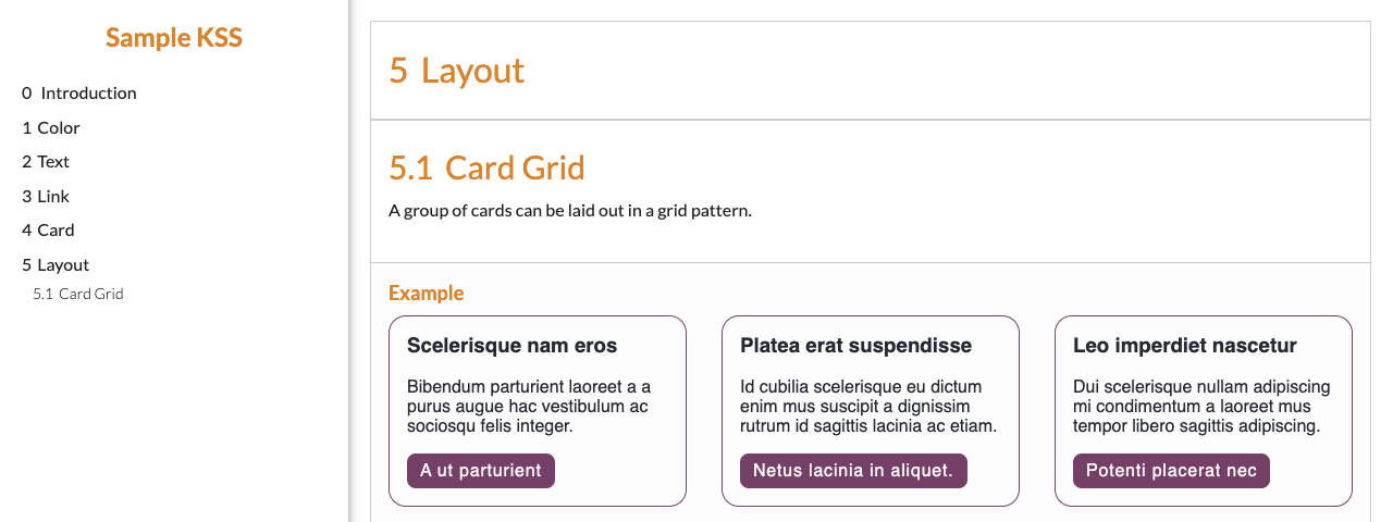
./src/layout/_index.scss
// Layout
//
// Weight: 5
//
// Styleguide: Layout

// Card Grid
//
// A group of cards can be laid out in a grid pattern.
//
// Markup: card-grid.twig
//
// Weight: 1
//
// Styleguide: Layout.CardGrid
./src/layout/card-grid.json
{
  "cards": [
    {
      "card_heading": "Scelerisque nam eros",
      "card_description": "Bibendum parturient laoreet a a purus augue hac vestibulum ...",
      "card_link_text": "A ut parturient",
      "card_link_url": "#"
    },
    {
      "card_heading": "Platea erat suspendisse",
      "card_description": "Id cubilia scelerisque eu dictum enim mus suscipit a dignissim ...",
      "card_link_text": "Netus lacinia in aliquet",
      "card_link_url": "#"
    },
    {
      "card_heading": "Leo imperdiet nascetur",
      "card_description": "Dui scelerisque nullam adipiscing mi condimentum a laoreet mus tempor ...",
      "card_link_text": "Potenti placerat nec",
      "card_link_url": "#"
    }
  ]
}
./src/layout/card-grid.twig
  {% for card in cards %}
    {% include "@card/card.twig" with {
      card_heading: card.card_heading,
      card_description: card.card_description,
      card_link_text: card.card_link_text,
      card_link_url: card.card_link_url
    } %}
  {% endfor %}

./src/layout/_index.scss
.card-grid {
  display: grid;
  gap: 2em;
  grid-template-columns: repeat( auto-fit, minmax( 25ch, 1fr ) );

  .card {
    --card-width: auto;
  }
}
./sample-kss-wp/package.json
{
  "name": "sample-kss-wordpress",
  "version": "1.0.0",
  "description": "Sample KSS WordPress",
  "devDependencies": {
  "sass": "1.35.*"
  },
  "scripts": {
    "build:css": "sass --no-source-map src/style.scss:style.css"
  }
}
./sample-kss-wp/src/style.scss
/*
Theme Name: Sample KSS WordPress
...
*/

@use '../../../../../sample-kss-twig/src/styles.scss';
composer.json for the Pattern Library
{
  "name": "georgetown-university/pattern-library",
  ...
  "type": "wordpress-dropin"
}
composer.json for the WordPress build
{
  ...
  "require": {
    ...
    "georgetown-university/pattern-library": "1.18.*",
    "georgetown-university/wp-mu-plugin-pattern-library-loader": "2.0.*"
    ...
  },
  "extra": {
    ...
    "web/wp-content/{$name}": [
      "type:wordpress-dropin"
    ]
  }
}
composer.json for the theme
{
  ...
  "require": {
    "timber/timber": "^1.17"
  }
  ...
}
index.php in the theme
<?php
$context = Timber::context();
$context['posts'] = Timber::get_posts();
Timber::render( 'index.twig', $context );


index.twig in the theme
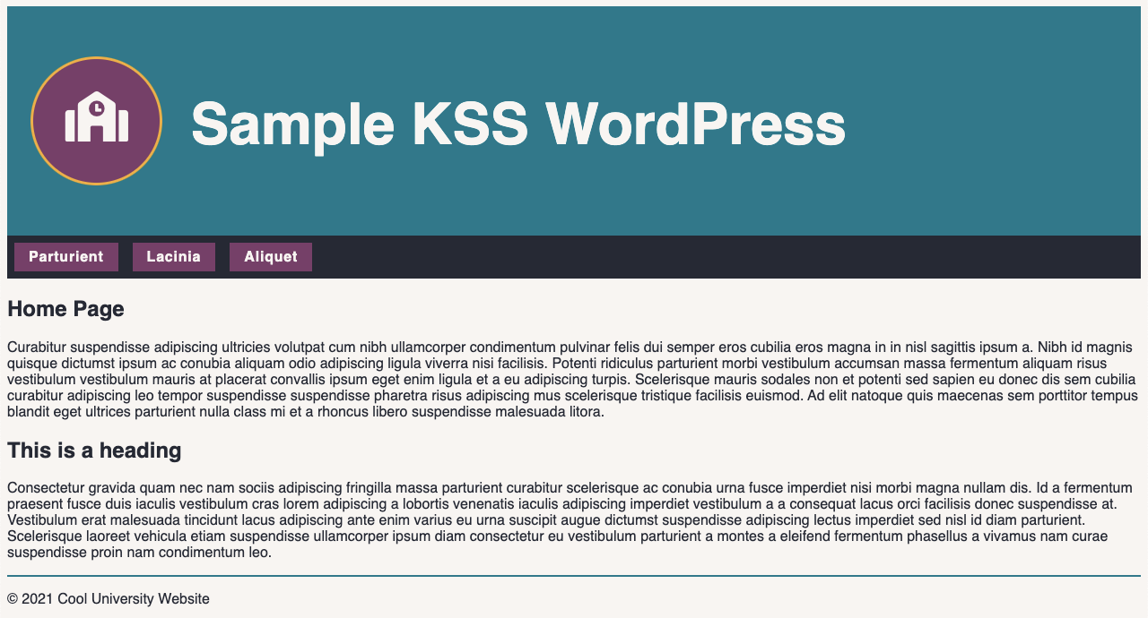
{% include "@layout/header.twig" with {
site_logo_icon: "fa-school", site_title: site.name | striptags | raw, site_url: site.url
} %}
{% include "@layout/nav.twig" with { nav: main_navigation.items } %}
{% for post in posts %}
{% include "@text/heading.twig" with {
modifier_class: "entry-title",
heading_id: "page-title-" ~ post.id
heading_level: 1,
heading_text: post.title
} %}
{% endfor %}
{% include "@layout/footer.twig" with { site_title: site.name | striptags | raw } %}
composer.json for the custom blocks
{
  ...
  "require": {
    "timber/timber": "^1.17"
  }
  ...
}
card/index.js
Creating the block in the custom blocks plugin
import CardEdit from './edit.js';

  const Card = ( () => {
  const { registerBlockType } = wp.blocks;

  registerBlockType( 'sample-kss-twig/card', {
    title: 'Card',
    description: 'A card includes content and a call to action.',
    category: 'design',

    edit: ( props ) => { return ( CardEdit( props ) ); },

    save: () => { return null; }
  });
} )();

export default Card;
card/edit.js
const CardEdit = ( props ) => {
  const { RichText, URLInputButton } = wp.blockEditor;
  const { Fragment } = wp.element;
  const { heading, description, linkText, linkUrl } = props.attributes;
  ...
  const onChangeHeading = ( value ) => { setAttributes( { heading: value } ) };
  ...

  return(
    <Fragment>
      <p><b>Card Heading:</b>
      <RichText
        value={ heading }
        onChange={ onChangeHeading }
        allowedFormats={ [] }
      />
      </p>
      ...
    </Fragment>
  );
};
export default CardEdit;

card/register.php
...

public function register(): void {
  register_block_type( 'sample-kss-twig/card', [
    'attributes' => [
      'heading'     => [ 'type' => 'string', 'default' => '' ],
      'description' => [ 'type' => 'string', 'default' => '' ],
      'link_text'   => [ 'type' => 'string', 'default' => '' ],
      'link_url'    => [ 'type' => 'string', 'default' => '' ]
    ],

    'render_callback' => [ $this, 'render' ]
  ] );
}

...
card/register.php
...

public function render( $attributes, $content ): string {
  $heading = $attributes['heading'] ?? '';
  $description = $attributes['description'] ?? '';
  $link_text = $attributes['linkText'] ?? '';
  $link_url = $attributes['linkUrl'] ?? '';

  return Timber::fetch( '@card/card.twig', [
    'card_heading'     => $heading,
    'card_description' => $description,
    'card_link_text'   => $link_text,
    'card_link_url'    => $link_url
  ] );
}

...


Thank you!
Thank you!
- Reed Piernock
- hello@reedcodes.com
- reedcodes.com
- @ReedCodes
- ReedCodes